

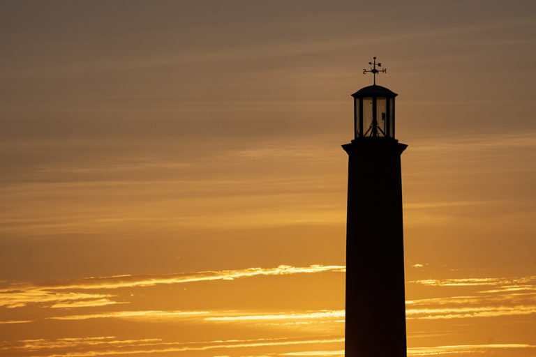
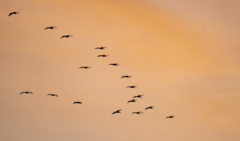
Photography is about time and light. We often don’t have the time and the light is rarely right when we do. That’s where patience comes in. Making time yields benefits for photography, slowing down, observing and being more considered. This is especially true with digital cameras which encourage us to shoot more not shoot better. This is what happened when I knew there was an image but didn’t know what. It took patience and a year and a half to find it.
Category: Anatomy of a photograph
Photography starts in the camera but in a time of digital cameras and editing software, it’s easy to rely on post-production instead of master the craft of photography. By looking at the anatomy of photographs – how they were composed, framed and shot – we can learn so much that helps us to get them right in-camera. In this series we look at various aspects of images, how we shoot them to see what secrets they reveal.
Finding space – keep it minimal
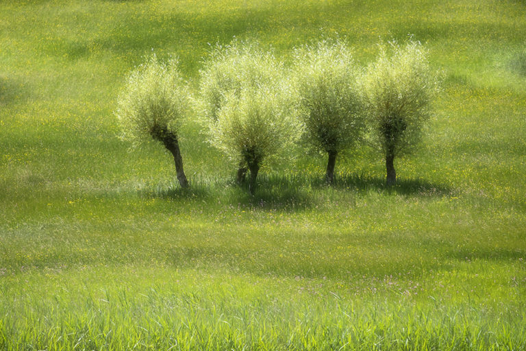
We’re all conscious of the need to find space and tranquility in our lives, and often travel to find it, but how can you incorporate this your photography too, to add impact and mood to an image? Using the four elements of design in your compositions will make them stronger and more engaging but adding space can take them to another level and enhance mood.
RGB – Colours of Nature

PART THREE – Red. A colour more associated with Autumn, red makes its first, strongest and most striking appearance as we move to warmer weather. Once a regular and widespread feature in the landscape, they are now returning as attentions turn to environment and conservation.
RGB – Colours of Nature
PART TWO – Green. With spring, nature brings vibrant colours and none more vibrant than green; the colour most associated with the natural world. So how do we use it with to convey the arrival of spring and as a graphic element?
RGB – Colours of Nature
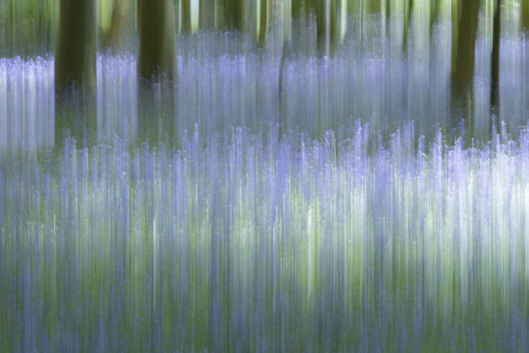
PART ONE – Blue. With spring, nature brings vibrant colours back to the dull winter landscape. One of the most stunning spectacles is when woodlands burst into colour with bluebells. So how do you photograph a bluebell wood and make it more than just pretty?
Essential cropping
We’ve all taken a shot where it wasn’t possible to get it completely perfect in-camera or events ruined our image. Here we look at how a careful crop might rescue an image.
To crop or not to crop?
What makes images powerful? Here we look at composition vs cropping.