
The winter landscape has seen trees as skeletons. Now, as we transition into spring, they start to put on their new clothes for the year and green is this season’s colour. Spring varies around the world but in temperate climates it sees an explosion of viridescence in all its many shades, but none more striking than the iridescent green of new foliage.
Catching a passing moment
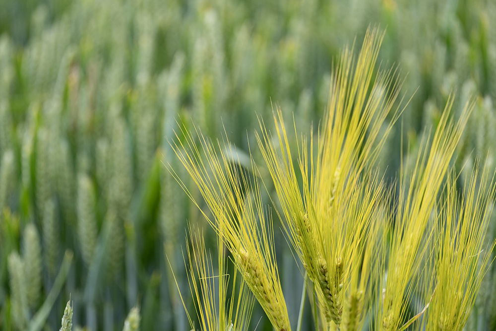
As the season progresses temperature start to rise and with this foliage colours change – still green but darker and less vibrant. The window to capture the brilliance of new life is limited so it’s really important to shoot early in spring if you want the most vibrant greens. Hesitate and a few days of bright, warm sunshine will take it away for another year.
No need to despair, though, if the moment of peak green eludes you. Vibrant is not the only green of spring and some of the more subtle and sober, sometimes near pastel shades, especially on overcast days, can be very evocative too.
Thinking colour in a different way
Colour is one of the four key elements of designs. It is a powerful compositional tool on its own, but capturing the colour requires more thought than simply capturing an image with green in it. Using the colour as a compositional tool often means combining it with at least one of the other compositional tools of shape, lines and texture/pattern.


Using the elements of design – line, shape colour and pattern all combine to create impact. Note how the different backgrounds reduce or enhance the impact of the shot and the definition of the subject.
Colour is seductive. It can easily dominate a composition and mask poor use of the other compositional elements. This is easy to do when shooting and, if you aren’t careful, it is only afterwards when looking at the final image, and it’s too late, that the mistake becomes obvious.
It’s worth noting that some cameras and films handle green better than others. Fujifilm films were alway renowned for this with punchy greens and an extensive range of subtle tones. This has carried through to their digital cameras. It’s not a bias towards green. It’s to do with the extended colour space which Fujifilm uses.
Looking for the shot
So where do you start? The first sign of spring is usually the snowdrops but they appear when winter still has a strong hold, sometimes even when snow is on the ground. It’s not until the weather starts to warm, maybe even two months later, that spring’s green mantle starts to manifest widely.


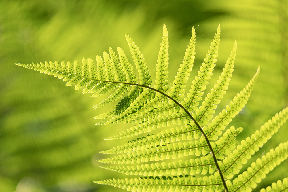
A good early indicator is the beech tree. It is one of the first to come into leaf so if you can find a beech woodland then it’s a great place to start, not least because the new green contrasts with a carpet of orange leaves from the previous autumn which often still cover the ground. The first new beech leaves are spectacular, especially when backlit.
One thing worth noting when shooting green in early spring is the low, bluish light of sunrise and the warm light of sunset. Whilst soft and often delightful, these change the greens to less vibrant tones, unless you want this, avoid this times. Adjusting your shooting time to make photographs a little later and a little earlier into day respectively, allows a softish light but keeps the vibrancy.
Of the three other design elements, other than colour that is, nature lends itself well to looking for and using texture and pattern in your compositions. You will find some exquisite ones even in the smallest details, so it’s worth looking for the smaller picture first, and getting up close, before working your way back out to larger subjects and a broader canvas.
Shot options


Changing the green – light through the foliage, colours on a dull day and foliage with direct light into the camera
Shooting into the sun, into the bright light, give us two options. The first is to let the sunlight shine directly through the foliage. This maximises the iridescent green. Moving slightly to allow the sun to shine into the camera directly, between rather than through the leaves, automatically changes the exposure, unless you compensate for this. Choosing not to here can give you an interesting option where even the most vibrant leaves start to wash out in a slightly surreal high-key style. It can be an interesting effect and certainly a contrast to the more vibrant shots.
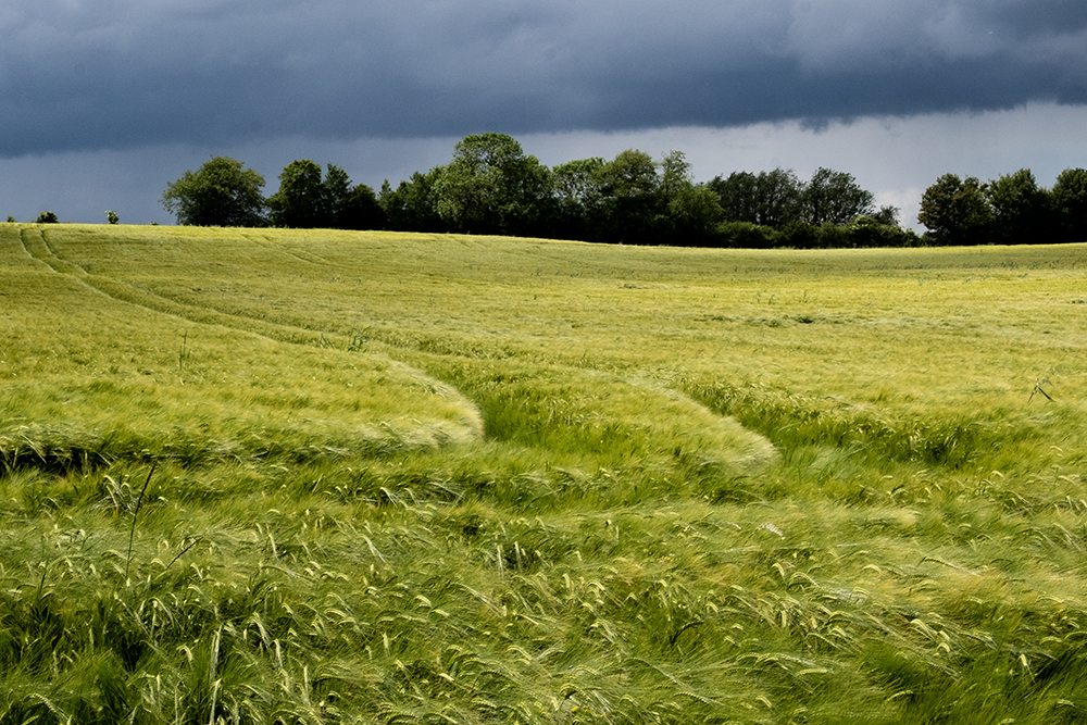
Remaining focused on the most vivid greens, wider landscapes set this colour off really well when the dark clouds of a passing storm are used as a backdrop.
Despite waiting for these vivid greens, you could be counter-intuitive and choose to shoot in black & white. It would be a bold move and works best if the subject matter implies that the green being photographed is vivid. The viewer is then left to translate the specific tones in their mind into their own greens. Be careful with black & white though. Using this medium, green and red have very similar tonal values and it’s extremely difficult – in other words it’s a guess – to tell them apart in monochrome.
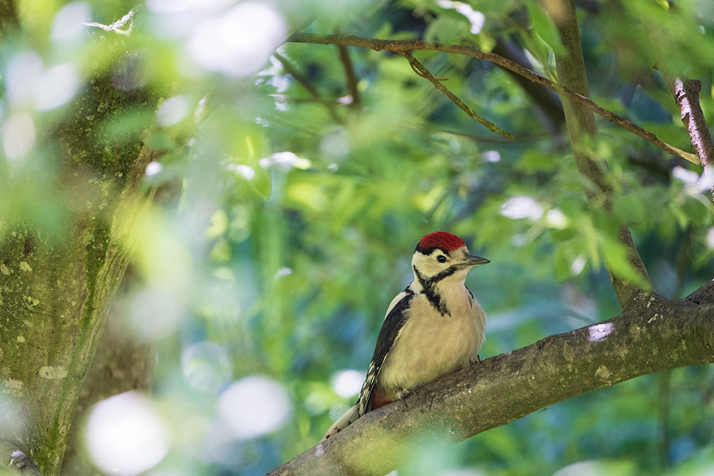
Green as a background


Green as a background. Shallow depth of field (limited focus range) push the green further into the background and towards just being a neutral backdrop with makes the subjects and contrasting colours stand out.
In nature, green is often thought of as a background colour and it works very well as this in all its many shades. Unless it’s very strong it can have an almost neutral effect setting off alternative colours without conflicting with them.

Colour as a frame
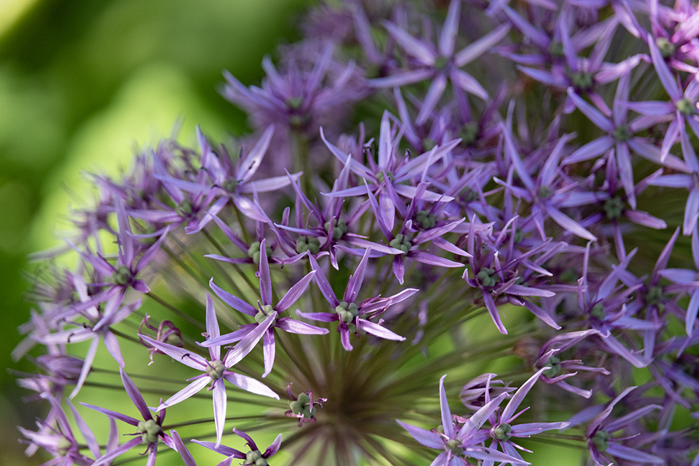
When photographing a subject of another single colour, especially a strong primary one like red or blue, the green acts as a canvas and is almost imperceptible as a natural supporting colour. It works especially well where it is thrown out of focus into a soft tone or tones.
Using the colour wheel we can take this a step further by choosing a subject with a colour from the opposite side of this wheel. For green, this will be a magenta to lilac tone and if you look at the shot of the allium you can see how well these compliment each other.
Thinking outside the box
Of course any colour can be changed or modified using exposure. Under-expose mid-green and it tends toward a forest green tone; over-expose it and it lightens, most often towards a greyish sage green colour, dependent on how vibrant the original green tone is.


Again, being slightly counter-intuitive by waiting for the vibrant greens of spring and then shooting when it’s overcast – and the light a little bluish – can yield some really interesting, subtle and striking tones, providing a lovely contrast to the the transient iridescence. It can also be a very good way to define mood in an image.
When photographing nature, many photographers tend to be literal or at least conventional in their approach. Try something different. Change your lens to, say, a very long telephoto and compress perspective, perhaps combined with a narrow depth of field. You can also use limited focus range with a close up lens then play with the angles which you shoot at. Nature is full of wonderful shapes and patterns. Use and play with these by shooting from unexpected or unpredictable viewpoints. Sometimes this will take compositions towards the surreal.
As you can see, green – the colour probably most associated with nature and the natural world – offers a myriad of possibilities for creativity. As always, the time you spending looking rather than the time you spend shooting will determine how creatively green you can be.
Read feature on colours blue and red
All images © Chris Coe
