
Spring’s transition to summer is marked by the arrival of new vibrant colours as flowers burst into bloom. Along the road verges and field margins, and sometimes in swathes in a field and on a hillside, the poppy is one of the most striking ones.


Poppies became a symbol of remembrance after growing on the churned up battle fields of Flanders during and after the First World War, but they have featured throughout history and even as far back as the pharaohs of Egypt – they appeared in the artwork on furniture and jewellery in King Tutankhamun’s tomb (1325 BC). In Ancient Egypt the poppy was emblematic of Osiris, the god of death.
Poppies are an annual plant which originated in the Middle East then spread to southern Europe and on to other areas, most often in connection with agriculture. The petals have been used as a mild pain killer through history but it is the opium poppy which is infamous. As an opiate, it’s the milk of this poppy species which has given it an elevated reputation and but other poppies are also important in the making of morphine. The history of the poppy is fascinating but that is another story.
For photographers they are a bold and vibrant opportunity to make some stunning photographs.
Where to find them
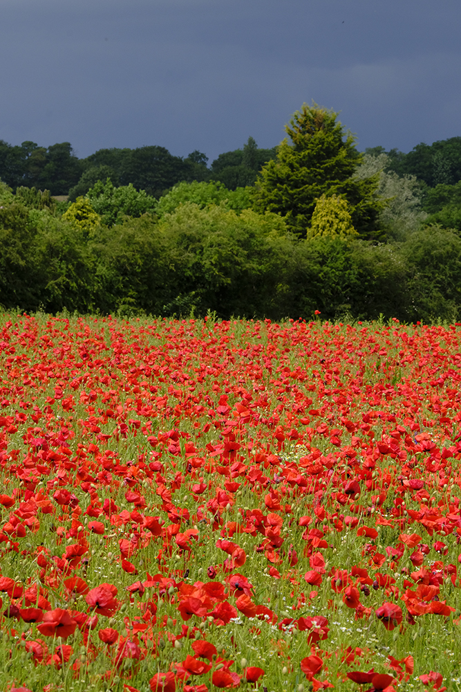
Poppies can be found in many places but have a close association with earth turned for agriculture, though modern farming techniques have made them less common, more unpredictable and harder to find than they used to be. So when you suddenly come across a bright red field with thousands of poppies then the camera has to come out!
In recent decades they have declined due to the extensive use of weed killers and cutting or mowing at a time which doesn’t coincide with the ripening of the seeds. As our environmental awareness start to reawaken, they are now returning, at least to field margins, and are a key marker in wild flower meadows. So expect to see more in coming years if wildlife and environmental conservation really does gather momentum.
The overwhelming red
There are very few things in nature, outside the tropics, which have such a strong red colour. It’s a colour which captures the imagination, associated with blood and passion. Poppies are eye catching in colour and striking en-mass. In Northern Europe the poppy marks the transition to warmer days and the imminent approach of summer.
Such a bright red colour is seductive but can easily dominate a composition, sometimes to its detriment. However, it also can present some fascinating creative options. One thing that you’ll rarely find, though, since the onset of colour photography, are photographs of poppies in black and white. These can work but must surely be considered as somewhat of a missed opportunity!


Looking for the shot
The poppy season doesn’t last long so when they burst into life make sure you don’t put off shooting until another day. When you find them, shoot them.
So where do you start? Poppies en-mass, an overview of a field of thousands, are usually the first option considered but this option is limited and, unless the light is perfect, shots quickly become repetitive. The wide shot tends to be something which is powerful to look at but less powerful in camera.
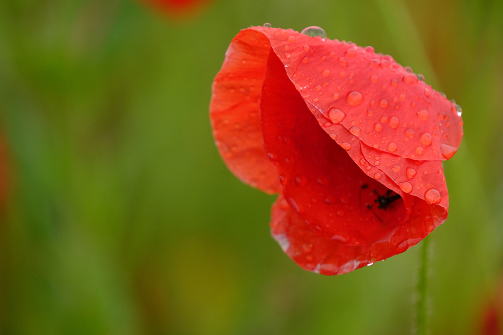
One thing that is interesting about photographing poppies, though, is that it does tend to be less weather dependent than some other flora and fauna. The sun brings out the colour’s vibrancy and the flower heads open fully but even in the rain there is a magic about them. Softer light gives really subtle tones. In the wet, raindrops gather on the petals before forcing the flower heads to bow down as the water weight increases.


Shot options
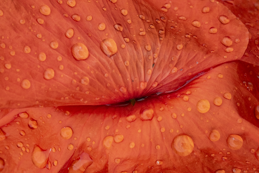
Once you have your wide shot the aim should be to get closer, then closer still. Here a narrow depth of field can be very powerful, isolating a single poppy or line of poppies against a soft, out of focus background. The closer you get and the longer the lens which you use, the softer the background.
Shooting into the sun, into the bright light, is a less used option. Exposuring as metered makes everything darker but dialing-in some exposure compensation lightening the image to compensate brings the vibrant colour back. In normal light, over-exposing, or high key exposure, washes out the colours with reds going first towards orange and more pastel tones.


Overcast light and rain works really well when photographing these enchanting flowers too. On a cloudy day, and especially early in the morning, the light has a blue hue. Interestingly this doesn’t affect the intense poppy red much but where the flowers are in a field of wheat or barley, this gets a definite blue colour cast.
In the rain, raindrops form on the flower heads like little lenses and create both an interesting optical effect and more texture in your shots, as long as you’re shooting up close.
Going more abstract or at least less literal
In nature, poppies are often seen either mixed in with a crop or in a wildflower meadow with other flowers, usually in colours other than red. You can use the contrasts creatively in your shots either to make the poppies pop, or as contrast. The most interesting options come when there are bright blue cornflowers in the mix.


Here again playing with exposure can be very effective and where the poppies don’t dominate you may well find that pastel tones from a high key over-exposure works best.
Thinking outside the box
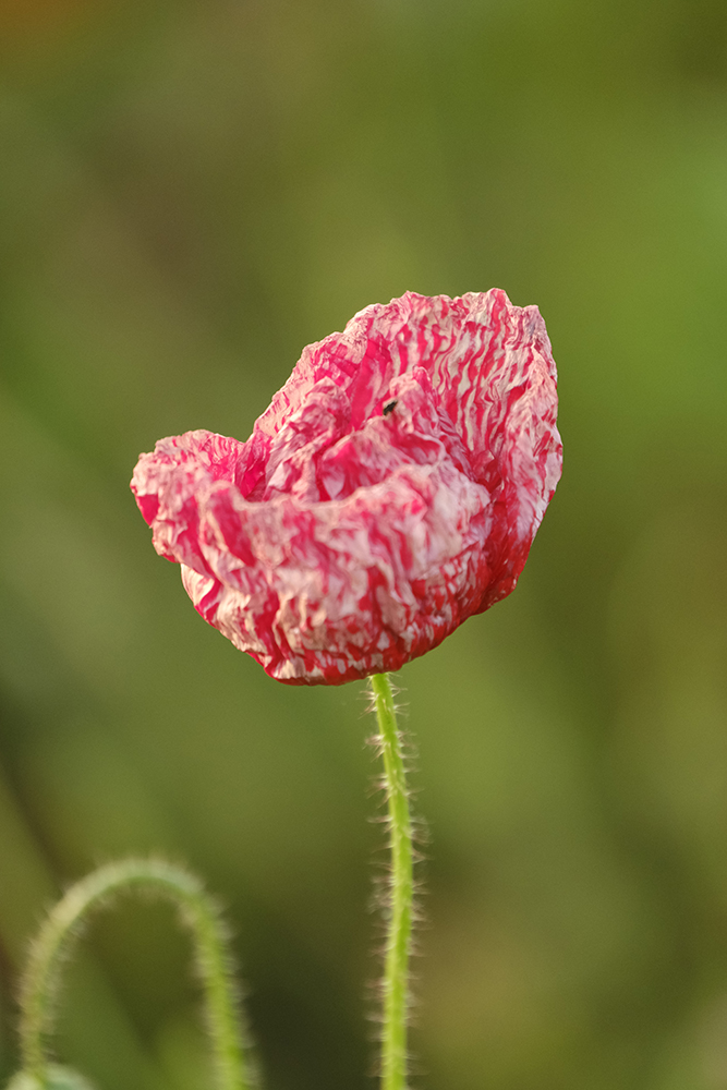
There are a couple of interesting things to consider to add variety to your shots. Occasionally tractor tracks will introduce lines but where these are absent, backgrounds can sometimes provide a textural backdrop. Keep an eye open for weathered or scarred poppy heads too, just to photograph something different but as the flower heads get older they often attract an army of small insects which will look a lot less attractive in your close up shots.
Then, of course, there is the option to introduce movement. In the summertime movement produced by air flow tends to be limited to gentle breezes rather than strong winds, so a tripod is essential to capture images with both static and motion-blurred elements.


If you want to go more abstract, as always there’s an option to move the camera instead. Slowish movement gives an extreme soft focus affect, while faster movement gives soft featureless ‘screensaver’ type images. The obvious movement is horizontal but try other directions, even diagonal.
Where the poppies are scarce other colours can also come through with the movement, most likely green, so have a play. The affect can appear layered. It’s fun and you may get something interesting in the process.
Shape and suggestion
Poppy red is naturally a powerful colour but when you get close, shape comes more into play. Moving right in on the poppy heads and excluding everything else and every other colour you’ll suddenly see faces, lips and even other shapes. This kind of abstraction and suggestion can yield some fascinating images.


Clockwise from to left – As shot; Colour desaturated; B&W; Infrared B&W
In abstract, this is probably the best opportunity to play with colour so look at desaturating or partially desaturating an image. Turning vibrant red into soft pink can be rather strikingly different. It’s also a good opportunity to go black and white, especially if the poppy head is dotted with rain or dewdrops. A straight black and white image can look a bit flat and bland but shoot in infrared black and white and the effect is stunning.
Red, Green, Blue – RGB
In this three part series we’ve looked at the three primary colours of light – red, green and blue – RGB. It’s a different way of thinking about the landscape as it changes with the season. It sounds simple but isn’t necessarily obvious to focus on a single colour at a time. What it will do, though, is improve your observation, improve your use of colour as a compositional tool and ultimately improve your photography.
All images © Chris Coe
