
One of the biggest issues which those newer to photography experience, and a trap which it’s easy to fall into, is to include too much in the frame, making compositions busy and muddled. More often than not, less is more. So how much less should we go or could we go, and how effective can a minimalist image be?
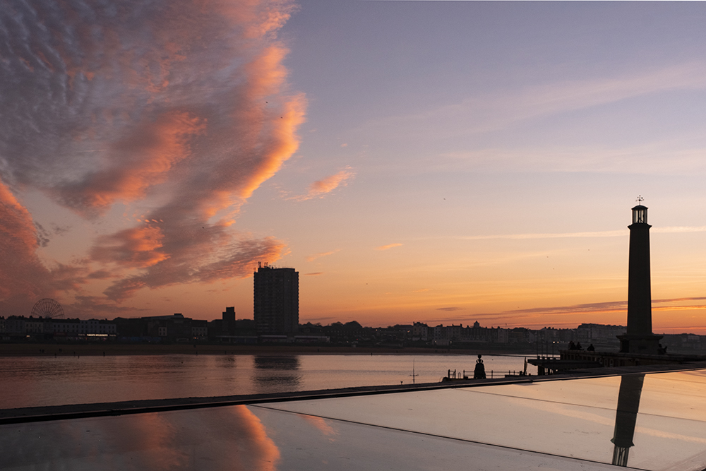
Although at first this shot appears to have lots of space in it, it also has lots of elements competing for your attention. It is busy – the lighthouse is most prominent but the reflection a little confusing; the tower block stands out and the ferris wheel is lost, or rather dominated by everything else and a striking sky. It’s a good example of where you should be taking several shots not just one (see example further below).
Space is a powerful compositional tool. There is no reason to fear it. In the most impactful images, the best and most memorable compositions, the subject of the photograph is clearly defined. This gives the viewer no option but to see it. Everything else in the frame is a secondary subject, or should be… in effect the supporting cast of actors to the star of the show.


An otherwise complex cityscape is simplified by soft, early morning light and mist (or smog). The space takes the landscape much smaller within the frame and gives a sense of the grand scale of the city and its environs. The second image has simply been cropped to remove the sun. This has effectively reduced the sense of scale and, by excluding the sun, reduced the contrast in the image. Even though it is the same image it doesn’t feel so open or engaging, and it’s much harder to explore without the space in the full frame.
In composition there are four elements of design which we use to achieve this. They are line, colour, shape and texture (pattern is effectively a texture). In black and white photography colour is replaced by tone.


The four elements of design are line, shape, texture and colour. In a B&W image colour is replaced by tone.
However, there is a fifth element which is often forgotten and that is space. All four other elements create direction within an image, which is why they are so powerful, if used well. They take the eye to where the creator wants it to go but are so destructive if used without thought or care, as in creating direction it is easy to lead the eye out of the frame rather than towards the subject.


It’s important to understand the elements of design in a composition. The direction of the boat adds powerful line to the composition whether it is in colour of B&W and the increased contrast combined with simplicity of tone in the B&W emphasise the importance of space in the scale of this image.
Space is extensibly directionless. The best analogy that comes to mind is it allows the subject to breathe. If everything else is tight around the subject it is almost claustrophobic. Space allows the viewer’s eye time to explore and find a direction to the subject, importantly without allowing or forcing the viewer to leave the frame. Although it is a very important compositional tool in creating impact, for most photographers it can be counter-intuitive to use.

Compare these two images. The only difference is space in the second one, but this dramatically affects the way you see the images. When you look at the first you go straight to the eyes and, because they are pointing out of the frame, you follow them and it is very difficult to see the rest of the picture. In the second, when you look at the eyes they take you into the space and this allows you to come back and see the hands, which in turn, take you up the body and back to the face. A pathway or loop has been created which keeps the viewer in the frame simply by including empty space.
Just like the other elements of design, it has to be used with care and often in conjunction with those elements. Let’s look at a few images and see what space contributes to them.


In both images, space forces your eye towards the main subject, the people.


Here’s the lighthouse from the first image (at the top). Simplifying and reframing have made it much more powerful and the subject is clearly the lighthouse in both shots. In the first, space and the direction of the clouds leading you to it make it stand out. In the second, it might seem strange to put the lighthouse so far to the left of the frame and on its own it would be. But the inclusion of the bird silhouette allows the space to connect the two and make a different way of framing work well with added context.
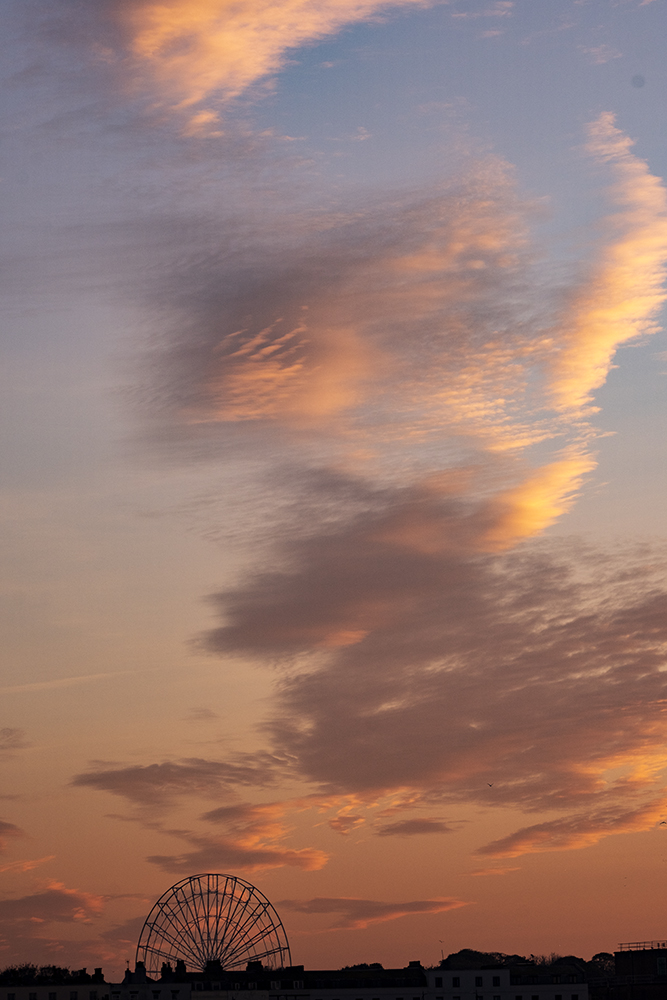
Without all the other distractions, the ferris wheel becomes prominent, even though it is small, and the sky becomes a colourful secondary subject which leads you to it.
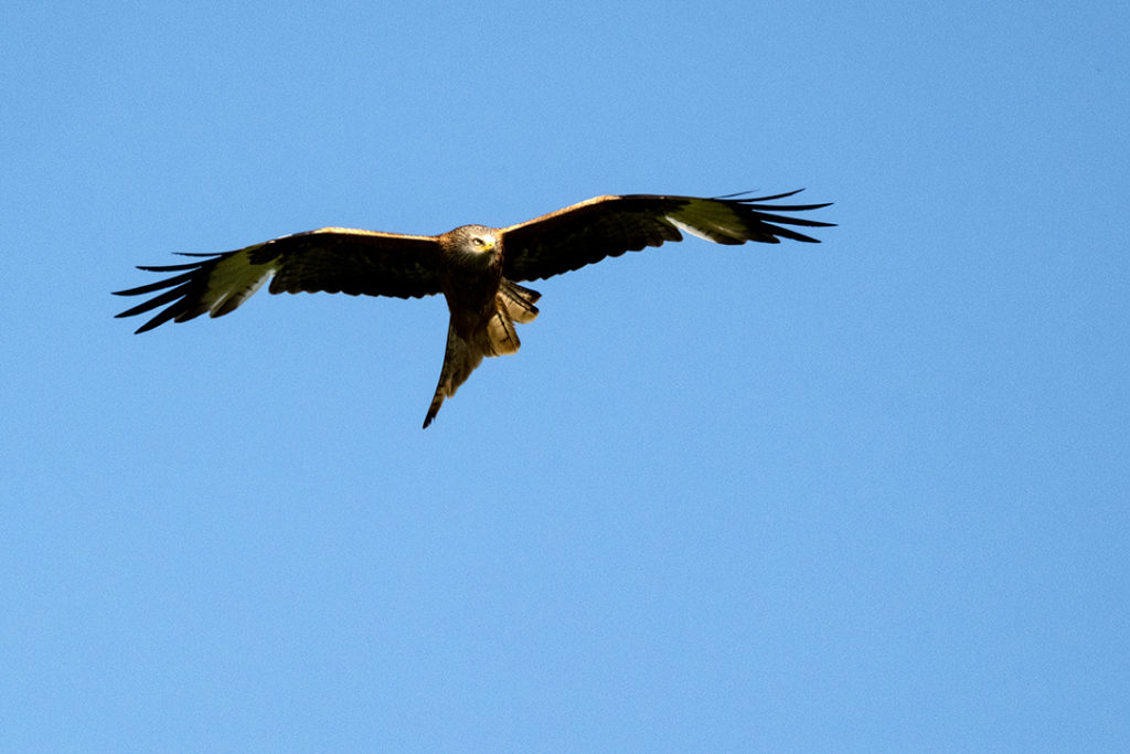
With images of a moving subject space has another role and its placement is critical. Let’s take, say, a bird in flight as an example. If the space is placed in front of the bird its flight is into the space and that movement has both a direction and is more powerful. However if the space is placed behind the subject, the direction of that subject takes you away from it and the viewer’s eye very quickly leaves the picture, reducing the impact, the sense of movement and the sense of openness in the image. It is the same whether the moving object is a person, a car or any other object.


With moving subjects, space in the direction of movement make the image much more dynamic than when the space is behind it.
Adding space is not just about adding emptiness. Sometimes the space isn’t completely empty but is so unobtrusive in the image as to act as space, as a neutral and undistracting area within that image.
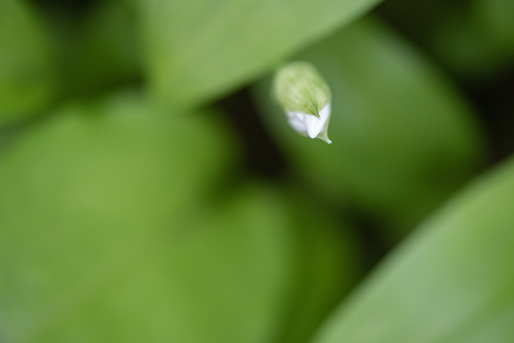
Here the space is created with focus. By using a very narrow depth of field, everything else except the tip of the wild garlic flower is soft and featureless. Effectively it is just the colour green. With careful positioning it should be possible to close off the dark areas between the out of focus leaves if you want to create a sold green background.


In the first image space is created by colour and in the second, by contrast. Even though neither are completely featureless, both are very powerful tools, when combined with framing, to add impact to the image and prominence to the main subject – the people in the first and the castle in the second.


It may sound strange and counter-intuitive but space is also a very important connector within an image. Compare these two: In the first image the space is just there and it doesn’t really lead you to anything in the frame. In fact it adds prominence to the wall in the top right of the images and this leads you out of the frame. However, in the second image simply ranging the camera to the left excludes the wall and the space then connects you to the distant trees.
Space can add a mood to an image which a more complex composition can struggle to convey. As you can see from the pictures in this feature, it doesn’t matter if it’s a people shot, a landscape or even an abstract, simplicity makes a minimalist image much more impactful and enhances or adds a mood to an image. Try it!


Silhouettes work well with lots of space. they are affectively space themselves. Just as an aside in the first shot, once you’ve seen the cartoon dog shape it’s impossible to unsee it! The shot of the sunset is virtually all space. A setting sun on its own would probably not be especially dramatic but here the shape of the heavy cloud and the landscape combine to give the shape of an eye to great effect.
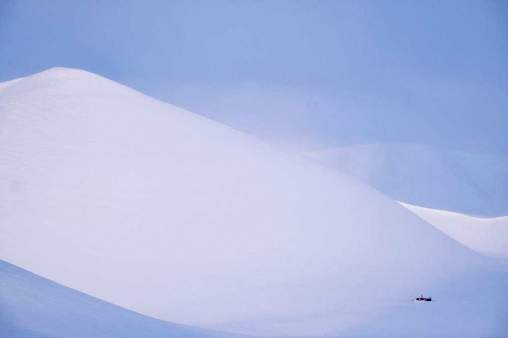
How much space is too much? The image above is over 90% space but it works, and it works with a quiet subtlety. It has line, shape, colour, texture and, yes, space, all combining to create something different and intriguing. You can’t get much more minimal than this but still include the five elements of design.
Next time you’re out shooting take the first image you see, then work out how you can simplify it by removing the clutter. You don’t have to fit everything into a single image. Just take more than one but make each simpler and cleaner. You’ll be surprised how much impact this adds. Then try to find a composition which uses space as the 5th element of design.
All images © Chris Coe
